 By Editorial Team
If you want to stand out, you can’t treat your brand identity as an afterthought anymore. For a PPC consultancy, it’s how you cut through the noise and land clients. A real brand is more than a logo. It’s the whole package that shows clients your specific value, builds their trust, and cements your spot as an expert in the ridiculously competitive world of digital ads.
Key Takeaways
- Nail down your agency’s core values and mission *before* you even think about logos. This keeps it real.
- Dig into what your competitors are doing with tools like Semrush so you can find a market gap and say something different.
- Build out your full visual kit, logo, color scheme, fonts, that actually connects with the kinds of clients you want to work with.
- Figure out your brand voice and build a messaging guide so you sound like the same expert agency everywhere, from your website to your emails.
- Set up a feedback system with your first few clients to make sure your brand positioning actually matches the work you’re delivering.
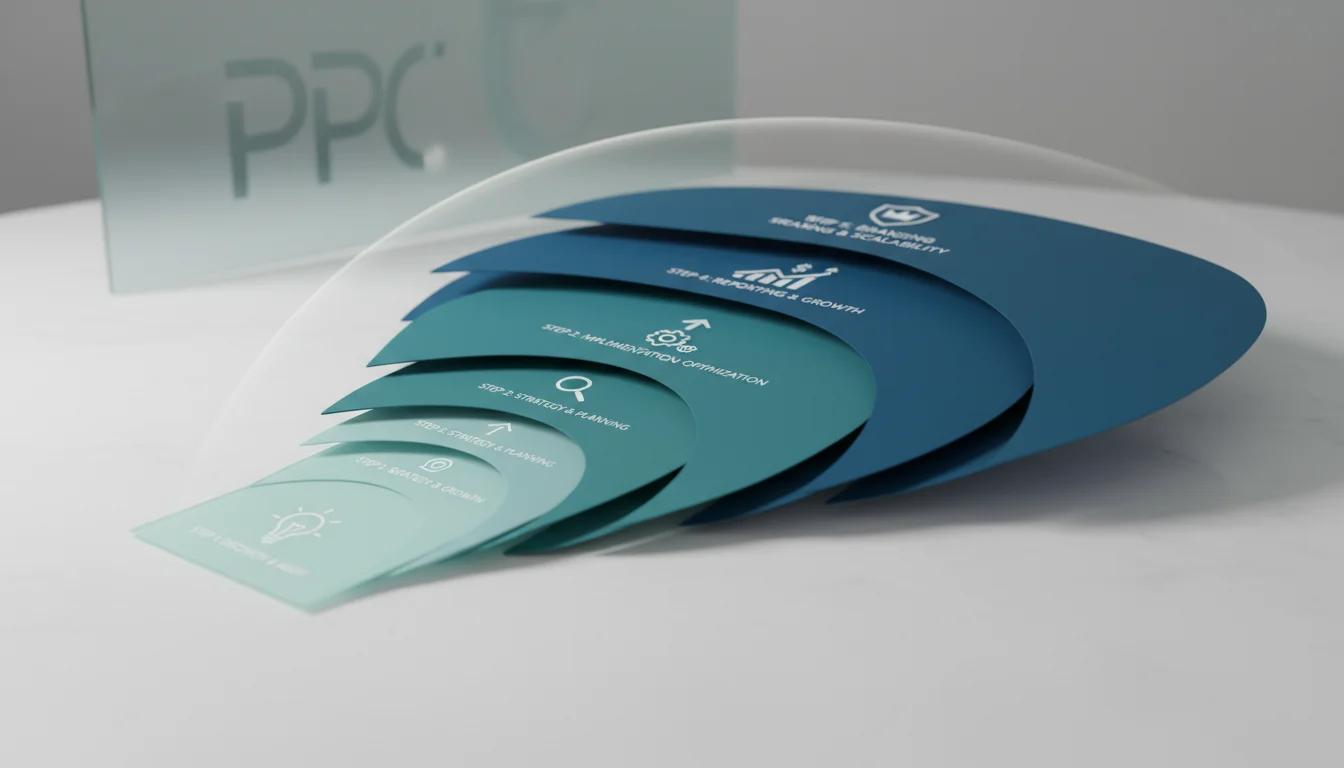
1. Define Your Core Values and Unique Selling Proposition (USP)
Don’t even think about design software yet. First, figure out what your PPC consultancy is all about. This is the foundation of your brand, not some fluffy marketing task. What do you do for clients that no one else can? Are you the go-to for e-commerce, B2B lead gen, or local service shops? Your USP has to be razor-sharp. An agency that lives and breathes complex Google Shopping feeds for huge retailers is playing a totally different game than one that crushes LinkedIn Ads for SaaS clients. Get in a room and list your non-negotiables, maybe it’s radical transparency in reporting, being 100% data-driven, or a focus on real ROI instead of vanity clicks. Then, boil it all down into a tight mission statement, like two sentences max. If you get this internal compass right, everything you put out there will feel authentic. Skip it, and your branding will just be a pretty shell with nothing inside.
2. Research Your Target Audience and Competitors
You have to know exactly who you’re talking to and who you’re fighting against. Are your ideal clients small shops on a tight budget, or are you chasing enterprise accounts that need heavy-duty campaign management? Everything from your brand’s tone to its colors depends on their needs and pain points. Next up: a deep dive into your competitor analysis. Fire up tools like Semrush or Ahrefs and tear apart their online footprint, and I mean everything, not just their ad campaigns. What do their websites and social profiles look like? What kind of case studies are they showing off? Pay attention to their imagery, their language, their strengths, and especially their weaknesses. The point is to find the open space in the market you can own. If everyone else is using boring corporate blue, maybe a punchy orange or a clean, minimalist grey is your ticket to getting noticed.
Pro Tip: The Niche Advantage
So many new consultancies make the classic mistake of trying to be the solution for everyone. Don’t do it. Specializing in one industry (like healthcare, legal, or SaaS) or a single platform (like Meta Ads for DTC brands) lets you build deep, undeniable expertise and craft a message that hits home. When you’re *the* agency for that niche, you’ll see better client retention and way more referrals, because your reputation will do the selling for you.
3. Develop Your Visual Identity: Logo, Color Palette, and Typography
This is what clients see first. Your logo needs to be memorable and scalable, but it also has to capture your agency’s vibe. Avoid those super-complex designs that turn into a smudge on a mobile screen. Seriously, hire a pro for this. A cheap-looking logo kills your credibility before you even get to pitch. You can find great freelance designers on a platform like 99designs, or if you want to meet in person, you could find a local agency in a spot like Atlanta’s Midtown district. Your color palette is all about emotion. Blues scream trust and competence. Greens feel like growth. Yellows bring a shot of energy. Just pick two or three main colors and a couple of accents, and stick to them. Typography matters, too. Serif fonts can feel traditional and authoritative, while sans-serifs usually come off as modern and clean. Just make sure whatever you choose is easy to read everywhere. Google Fonts has a massive library of free, solid options.
Common Mistake: Inconsistent Visuals
Nothing looks more amateur than using a slightly-off version of your logo, different shades of your brand colors, or a random mix of fonts across your site, proposals, and social media. It just screams unprofessional. Fix this by creating a simple brand style guide. This document should spell out the exact color codes (HEX, RGB, CMYK), the official fonts and sizes, and the rules for using your logo. Give it to your team and any contractors you work with. No excuses.
4. Craft Your Brand Voice and Messaging
Your brand voice is how your agency’s personality comes through in words, both written and spoken. Are you the serious, academic authority, or are you the approachable, in-the-trenches partner? Witty and fun, or direct and all-business? Whatever you choose, that voice has to be the same everywhere: website copy, newsletters, social posts, proposals, even how the phone gets answered. Build a messaging framework that puts your value prop, key benefits, and what makes you different into clear terms. Have some boilerplate copy ready for things like intro emails or service descriptions so your whole team sounds like they work for the same company. For a PPC shop, potential clients almost always respond to a voice that focuses on hard numbers, smart strategy, and transparent reporting. And while a HubSpot report on marketing statistics says 72% of consumers like humor, make sure it actually fits your brand and your audience before you start cracking jokes in a proposal.
5. Build Your Online Presence with Brand Consistency
Think of your website as your digital storefront. It has to be a perfect reflection of your brand identity. Your logo needs to be front and center, your colors have to be spot-on, and your brand voice must be clear in every sentence. The site should be simple to get around, clearly lay out what you do, and prove you know your stuff with real case studies and client testimonials (and yes, they have to be *real* successes, not made-up junk). That consistency needs to extend everywhere else you exist online:
- Social Media Profiles: Your profile pics, cover photos, and bios on LinkedIn, X, or wherever you hang out should all be on-brand.
- Email Signatures: Get your logo and brand colors in there.
- Proposals and Presentations: These must follow your brand style guide to the letter. Use branded templates. Always.
- Advertising Campaigns: Your own PPC campaigns better be a shining example of the quality you sell to clients.
Being obsessive about this consistency is how you build recognition and look like a pro.
6. Implement a Feedback Loop and Iterate
Your brand identity isn’t set in stone. It’s going to change as your business grows. As soon as you launch, start asking for feedback. Talk to your first clients. Does the brand they see match the experience they’re getting? Does your messaging actually connect with them? You can use quick surveys or just have informal chats. Keep an eye on how the brand is performing. Are you getting the right kinds of leads? Are your proposals landing? You can even use a tool like Hotjar to see how people are behaving on your website, which can tell you if your message is hitting or missing. Be ready to tweak things based on that real-world data. Maybe your colors are too loud, or your voice is too casual for the enterprise clients you want. Changing things based on feedback is a sign of a smart, healthy brand.
Pro Tip: Employee Brand Ambassadors
Your own team can be your most powerful brand ambassadors. Make sure they get the brand values and voice. Train them on the style guide and get them to share your agency’s content on their own professional networks. When your employees actually believe in the brand, it makes your message ten times stronger. Crafting a strong PPC consultancy branding strategy comes down to smart planning and relentless execution. When you define your values, know your market inside and out, and stay consistent with your look and voice, you’ll build a recognizable identity that brings in the clients you actually want.
What is the difference between a brand identity and branding?
Brand identity is the tangible stuff: your logo, color palette, fonts, and imagery. Branding is the whole process of shaping how people see you, it’s everything from your identity to your customer service and the entire client experience.
How often should a PPC consultancy rebrand?
You don’t do a full rebrand every year. Most agencies think about it every 5 to 10 years, or if there’s a huge change in their services, clients, or what they stand for. You can do smaller visual or messaging refreshes more often, maybe every 2 or 3 years, just to stay current.
Can a small PPC consultancy afford professional branding?
Yes. Big agencies might spend a fortune, but a small consultancy can get great design and strategy work from freelance platforms, local designers, or branding firms that work with startups. The cost can vary a lot, but trying to save money by skipping branding usually costs you more in the long run because you’ll just blend in and miss out on clients.
Should my brand voice be formal or informal for a PPC consultancy?
Your brand voice depends completely on who you’re selling to. If you’re targeting corporate clients in finance or healthcare, a formal, data-heavy, authoritative voice is probably your best bet. If you’re after creative startups or direct-to-consumer e-commerce brands, a more conversational, and maybe even witty, tone will probably work better. The most important thing is picking a voice and sticking with it.
What are the essential elements of a brand style guide?
A solid brand style guide needs to cover your logo rules (how to use it, how not to, minimum size, etc.), your primary and secondary color palettes (with all the codes: HEX, RGB, CMYK), your typography (which fonts to use for headlines vs. body text), your imagery style (the kind of photos or graphics you use), and your brand voice (tone, specific words to use or avoid, grammar).


